
I was traveling internationally last week for some meetings in London as well as a side visit to Paris prior to Chunneling it to London. While I was hoping to discuss Paris this week, given limited time and the market’s reaction to last week’s CPI report, I thought I would briefly show some charts reiterating how all roads lead to the Fed and interest rates.
Hopefully, Paris will be next week.
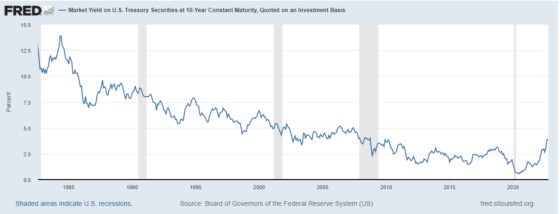
The CPI report showed that headline inflation dropped to a still very high 8.2%, but core inflation, which excludes food and energy, hit a 40-year high. Interestingly the great bull market started after the stock market hit bottom in August 1982 when investors became convinced that the Volcker Fed had finally broken the back of inflation and that interest rates were much closer to peaking and coming down than continuing their rapid ascent higher. As the following chart shows, which begins in 1982, long-term interest rates came down for a short period of time and then went higher until mid-1984. After that, however, it was a fairly continuous downtrend for 36 years until the trend was broken recently.
We’re now back to 1982 levels for core inflation (excluding food and energy), as this headline shows.

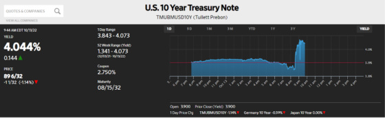
The bond market did not take too kindly to the news as it priced in a Federal Reserve that will remain violently hawkish. One can see how 10-year Treasury yields shot up after the CPI report was released.
I’m not sure when interest rates are going to peak, but 40 years ago, the market took off on an incredible ride, albeit not straight up, once investors became convinced that the Fed had broken the back of inflation. This post will include graphs that have convinced me that we won’t show a meaningful reversal in the market until investors are convinced that rates will come down this time as well.
I don’t think it’s enough for bad economic news to come out to convince investors the Fed will pivot. I think the news has to be quite bad, pervasive, and persistent. It can’t be restricted to one major interest rate-sensitive industry like housing but throughout the economy. If it’s short, then it must be deep, and if it’s shallow, then it must last a while to firmly convince the Fed that they have beaten back inflation for this cycle.
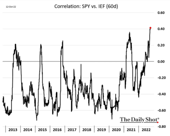
These charts convey how so many market sectors are now more correlated with interest rates than they have been in a very long time. This means that when Treasury prices increase (yields drop), then each of these sectors tend to see their stock prices go up as well. The opposite is true when Treasury prices drop (yields rise), and these sectors see their stock prices drop.
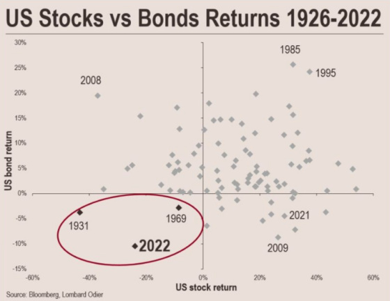
This first chart shows just how unusual this year is with both stocks and bonds producing negative returns, which confirms the positive correlation that has arisen.
Now let’s turn to the overall market and sub-categories to show how correlations have become positive for all of them.
This first chart shows the correlation with the overall market (S&P 500) and Treasury prices.
Value stocks are also now highly correlated with Treasuries.

Small cap stocks:

This next chart is the most fascinating one to me. Bank stocks are almost always negatively correlated with Treasury prices. When Treasury prices drop, and yields rise, bank stocks typically see their share prices rise. This is because their net interest margin, a proxy for profitability, tends to rise because the rates they can charge for loans usually rise much faster than the cost of their deposits. Perhaps this time is different because the market is concerned that banks will be losing deposits to money market funds and Treasury purchases (now that 2-year yields are close to 4.50%), which will put pressure on their deposit rates. Or, perhaps the economy will decelerate rapidly or even contract, which could harm their credit quality. They will have to write off loans, or they will not be able to generate as many loans due to deteriorating credit quality or more conservative underwriting standards. Whatever it is, this is a very unusual situation. One can see that this is the only time over the last ten years that bank stocks have had a positive correlation with Treasury prices. For years Investors have been saying, “wait until interest rates rise, financials will take off, and that will be the place to be invested.” Unfortunately, not even this sector has been safe from a brutal downturn, despite historical correlations that would have suggested otherwise.

Industrials:

Transportation:

Materials:

Housing is another sector that, like banking, should typically have a negative correlation. And yet, it has some periods in which its correlations are the highest among all of the sectors shown. This suggests that rising rates are not always bad for the economy and housing in particular.
If rates go up because the economy is strong, then this should still be supportive for new home purchases, provided that mortgage rates don’t go up a significant amount. There are other times when rates are dropping because the economy is very weak or contracting, which is not good for consumer confidence and the new home market. In addition, when a hawkish Fed raising rates can lead to a material slowdown in the economy, then this is typically not good for new home purchases as well.

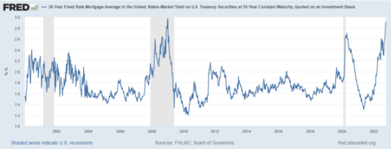
Right now, higher rates are very painful for homebuilders because it translates to much higher mortgage rates as the premium investors require for purchasing mortgages is at very high levels, as this chart shows. This is a huge challenge for the housing market, and with the Fed no longer purchasing mortgage-backed securities and potentially at risk of selling them, mortgage rates will probably remain elevated relative to underlying 10-year Treasuries. With that being said, the premium mortgages are offering is very compelling based on where they peaked in 2008-9 and 2020 during Covid.
Finally, we have retail stocks, which are typically quite negatively correlated with interest rates, with some occasional exceptions of mildly positive correlations. This, too, makes sense because consumer spending can often be fueled by credit cards, home equity loans, and other forms of borrowing, so when rates rise, this can harm the purchasing power of consumers.

If history is any guide, then perhaps we’re closer to interest rates peaking and a new bull market starting. This chart from www.sentimentrader.com shows the trajectory of the five other times that stock market returns have produced worse returns than -20% through the first 195 trading days and the average results for the rest of the year. One can see that they tend to flatten out as the rest of the year unfolds.

The encouraging thing to note is that in each of these years, 12 months later, they all produced positive returns that were quite impressive. The return generated in the aftermath of the Great Financial Crisis was far less than the other four but still positive nonetheless.

Here are some of the observations they draw from their research.
What the research tells us…
Tiny sample sizes are troublesome, though we can have a bit more confidence in them if their consistency in forward returns is high. That’s arguable with this one, but it’s notable that when severe price declines and seasonality combine, it can have powerful effects. Barring another financial crisis, which certainly seems to be a worry, the recent decline and seasonal combo look bullish.
Early in the blog, I showed a chart of the 10-year Treasury yield and how it shot up after the release of the CPI report last Thursday. In a pretty remarkable turnaround, however, the yield dropped pretty significantly from its intraday high to close under 4%. While still up for the day, it was still under the psychologically critical 4% level.

And just as this post has pointed out, the stock market exploded higher in conjunction. The S&P 500 rose by nearly 3% from trough to peak in one of the most remarkable intraday turnarounds in over 30 years. To me, this is another powerful piece of evidence pointing to the fact that all roads lead to the Fed. If investors think rates are close to peaking, then this should be very favorable for the stock market. If this is not the case, however, then it’s conceivable that there could be more pain ahead, particularly if Fed policy leads to a financial crisis that drags the economy down with it.
And if this chart overlaying the recent path of stock market volatility with 2008 and 2009 is an indication of what lies ahead, then applying the caveat of future strong returns occurring if we are not facing another financial crisis could be a very big if.

Leave a Reply