
I thought I would return to a post focusing on charts that I found compelling this past week. The Fed is now telegraphing an imminent slowdown of its purchases of Treasuries and mortgage-backed securities. The reaction of bond investors led to a narrowing of the yield curve. Typically a steep yield curve, whereby longer rates are significantly higher than shorter ones, telegraphs stronger economic growth ahead. A narrow or inverted yield curve (long rates are lower than short rates) foreshadows a slowing or contracting economy. Investors seem to think that the Fed’s tapering of its securities purchases will be a bit of a headwind for the economy.
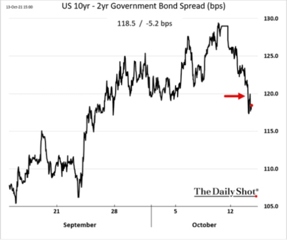
2-year rates moved up fairly sharply as it is pricing in a Fed starting to raise rates in 2022.

Right now, despite seemingly strong post-Covid economic growth, the yield curve could be rolling over which would make it the first time in over 30 years that it will not have steepened from its cycle low to a spread of approximately 2.5% or greater. This suggests a very tepid cumulative recovery and one that could be hindered by the very painful supply chain disruptions, labor availability, political gridlock generating fiscal headwinds, and soaring energy prices, along with other commodities.
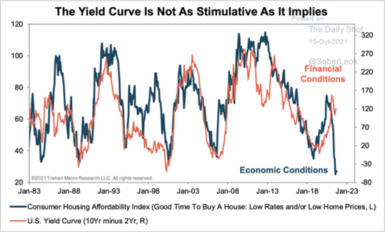
Interestingly, in spite of a steepening yield curve, which is historically bullish for housing, prices have risen so far and so fast that affordability has become a concern, thereby dampening some of the stimulative effects of a steepening yield curve.
One can see how asking prices for homes for sale continue to escalate rapidly.

The long run for housing should still be strong, especially if adults living at home start to form their own households.

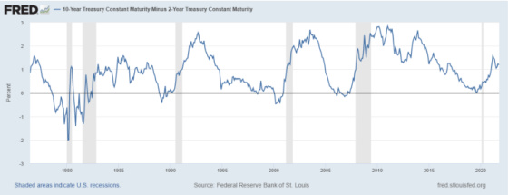
This chart shows historical trends in curve steepening in the aftermath of recessions. If history is any guide then, it should keep steepening, but the previous chart calls that into question, especially if a less accommodating Fed and more constrained fiscal policy have their usual slowing effect.

Another indicator I like to look at is the spread between more risky bonds (Baa rated) and far less risky ones (AAA rated). The lower the spread, the greater the risk appetite of lenders. The opposite is the case when spreads are wide. Right now we are at historical cycle lows which suggests that the risk lies in credit becoming more costly and less accommodating to borrowers assuming spreads follow their historical pattern and rise from these levels. One can see how the Great Financial Crisis of 2007-9 had a much more profound effect on credit markets than Covid. This is because the government’s response to the latter was far more massive than the former. In addition, the problems were centered in the banking system then versus the Covid shutdown which catalyzed a tremendous credit crunch as lenders were under great financial pressure.

This next chart shows the same spread indicator but after the Great Financial Crisis so that the distortion of that event is stripped out. One can see the spread hitting a cycle low and it looks like it may be rising ever so slowly from the bottom. The Covid peak exceeded the previous two cycle peaks but not anywhere close to where it was in 2008-9 and only about 30 basis points higher than in 2012 and 2016.

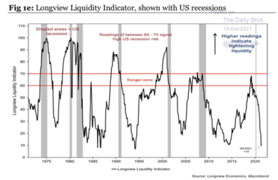
This next chart seems to corroborate the very tight Baa-AAA spread as liquidity indicators are extremely favorable and, based on historical trends, can only deteriorate from here.
One continuing challenge for materially higher U.S. Treasury yields is the enormous amount of negative yielding sovereign debt around the world.

And while inflation is without question currently running hot, central banks around the world have had a very difficult time achieving an inflation rate at or above its target.

One can see that inflation is on the rise after taking a sharp turn downwards during Covid.

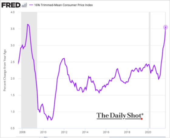
This next measure of inflation, the Trimmed-Mean Consumer Price Index, is showing a rapid rise. What is this index you ask? Here’s some background from the Dallas Fed, which publishes it.
In spite of the arcane-sounding name, the concept of a trimmed mean is a simple one. In fact, trimmed means should be familiar to any follower of international figure skating. In the wake of the controversies surrounding the judging at the 2002 Winter Olympics, the International Skating Union adopted a scoring system in which a skater’s highest and lowest marks are discarded before the skater’s average score is calculated. Trimmed mean inflation rates are derived by a similar procedure.
24 percent of the weight from the lower tail and 31 percent of the weight in the upper tail are trimmed. Those proportions have been chosen, based on historical data, to give the best fit between the trimmed mean inflation rate and proxies for the true core PCE inflation rate. The resulting inflation measure has been shown to outperform the more conventional “excluding food and energy” measure as a gauge of core inflation.
Oxford Economics believes that inflation is peaking and should start dropping fairly materially over the next year.

If the historical correlation of the next chart holds true, then Oxford Economics may be too sanguine about inflation coming down like it is projecting.
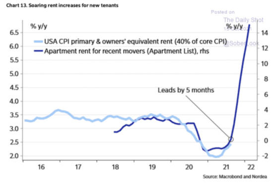
The apartment market has never been tighter as this chart shows.

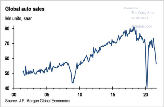
My son has a car that is leased and it ends in May 2022. My usual course of action is to return it and lease a new one. With global auto production being severely impacted by the semiconductor shortage, however, I decided to strongly consider purchasing the car when the lease ends. I looked at the residual value and saw that it is less than its market value so, unless something changes on the supply front, I intend to purchase it. It gives me more optionality as I don’t have to scramble to lease or buy another car in a very undersupplied market. It’s also a good value and buys me time until supply can catch up to demand. This chart shows how global auto sales have come crashing down. I would bet this is not a demand problem at all, but solely a function of curtailed supply.
One can see how supply-chain issues are taking on even more prominence in investor calls and in the media. I don’t see this ending anytime soon, absent a demand-crushing recession.


With energy costs soaring, home heating bills are expected to follow suit, which will be a drag on consumer spending. There’s also sticker shock again for filling up one’s tank, particularly in California, where I recently paid over $5 per gallon to fill my tank.

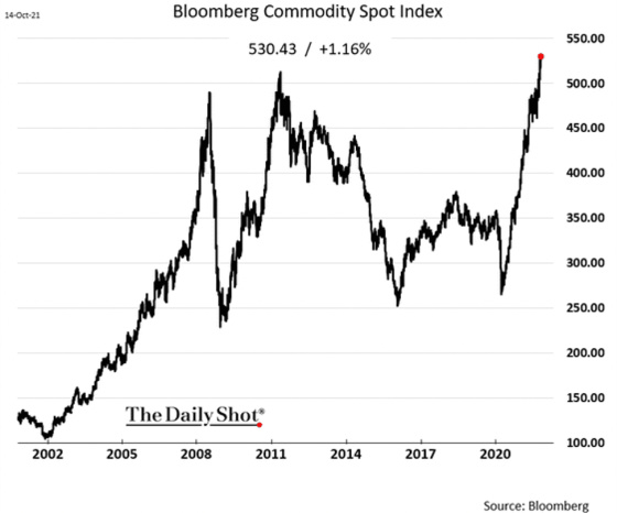
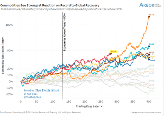
Right now the resurgence of commodity prices from the recession low is the highest on record. Will we see an explosive blow off phase like what took place in 1971 or will we see prices come back down to earth like most of the other cycles?
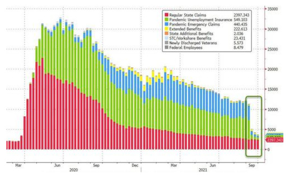
On the labor front one can see how we are now seeing the impact of unemployment benefits being cut has led to a drop of weekly claims for unemployment benefits of over 18 million from the same time last year.

This shows the data in graphical form.
Interestingly, the biggest change in the number of people not working was due to taking care of someone with Covid symptoms.
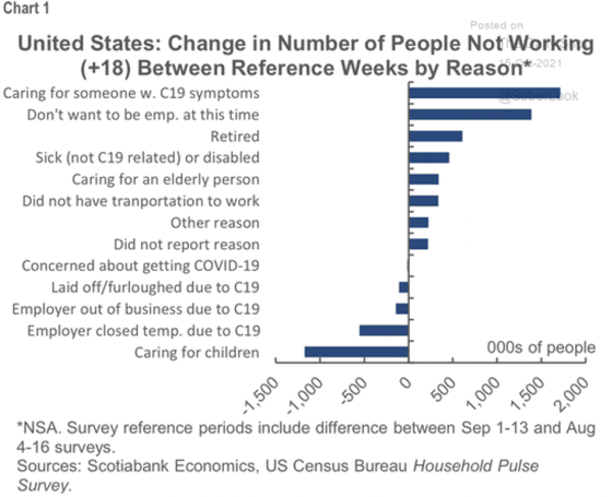
Childcare is now not as necessary as it was when so many schools were closed.

Workers are quitting at astronomical rates, particularly in the accommodation and food services industries.
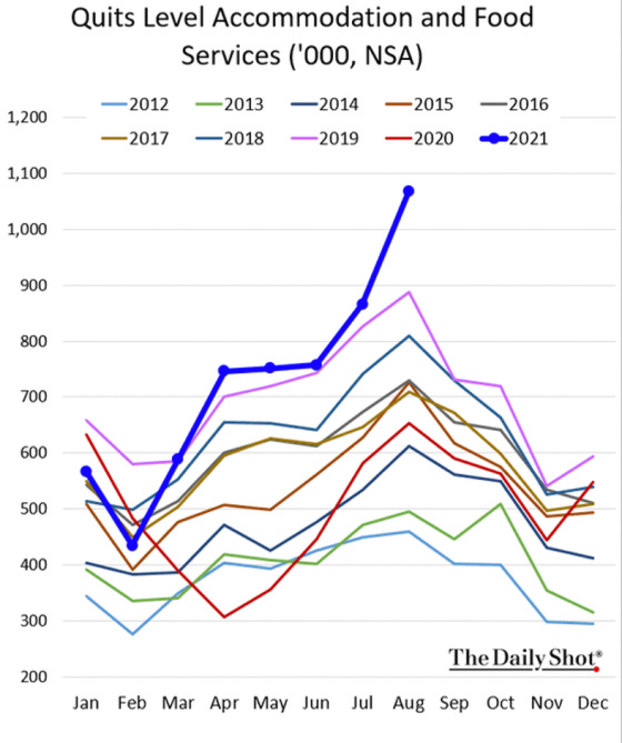

One theory is that people are sick and tired of being mistreated by impatient customers as well as there being opportunities in other industries that are less demanding. The plunging rate of job happiness among young people, the most represented cohort working in accommodation and food services, would seem to add plausibility to this theory.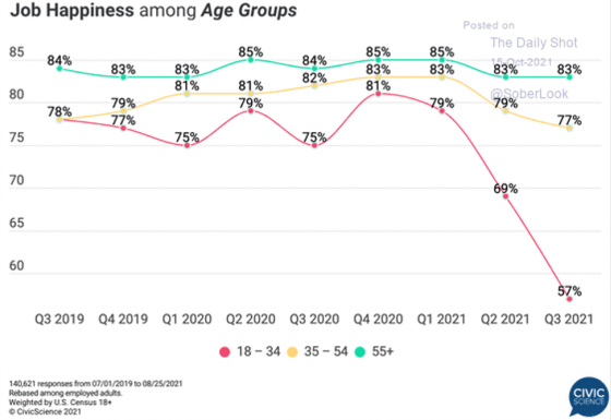
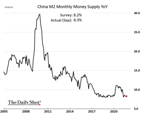
Finally, to some degree as China goes, so does the world economy. These next charts show how the growth rate of two of its money supply indicators has been slowing for a while now.

Here is one of my favorite Hemingway passages from The Sun Also Rises.
“How did you go bankrupt?' Two ways. Gradually, then suddenly.”Click To Tweet
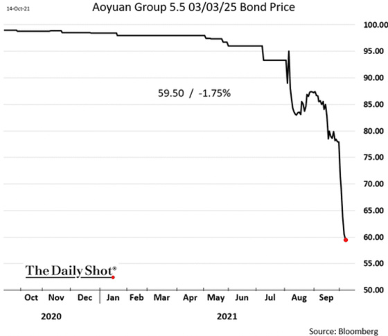
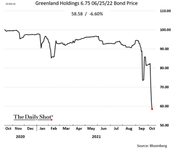
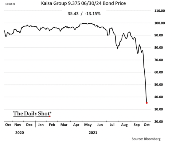
This has such great applicability to investing as well. I could write a whole blog on that quote but since this one has gone far longer than I expected it to, I will show this graphically by sharing the price of bonds for some Chinese real estate developers. Hemingway is probably smiling somewhere as he looks down below and sees what is happening in China with life imitating his art.
Leave a Reply