Last week I discussed how recessions have not occurred until an inverted yield curve reverts to being positively sloped such that long rates are higher than short rates. I wanted to do a bit of a deeper dive to see what it means for employment peaks. I looked at the few times since 1989 when the 2-year Treasury note yield and 3-month Treasury bill yields were higher than the 10-year Treasury note yield.
I identified when these curves were most inverted and how long it took for non-farm payrolls to peak. This analysis is a little dicey, however, because oftentimes, there can be large revisions to the payroll numbers, but such is life. You have to go to war with the army you have and not the one you wished you had. Here is the data I put together.
10-Year Minus 2-Year
| Maximum Inversion | Date | Non-Farm Payroll Peak | # of Months between Max Inversion & Payroll Peak | Spread at Peak Payroll Month |
| -0.43% | 3/30/89 | August 1990 | 17 | 0.79% |
| -0.53% | 4/7/2000 | February 2001 | 10 | 0.51% |
| -0.19% | 11/1/2006 | January 2008 | 14 | 1.50% |
| -1.07% | 3/8/23 | N/A | N/A | N/A |
10-Year Minus 3-Month
| Maximum Inversion | Date | Non-Farm Payroll Peak | # of Months between Max Inversion & Payroll Peak | Spread at Peak Payroll Month |
| -0.35% | 6/9/89 | August 1990 | 14 | 1.23% |
| -0.95% | 1/2/2001 | February 2001 | 1 | 0.07% |
| -0.64% | 2/27/2007 | January 2008 | 11 | 1.71% |
| -1.89% | 6/1/2023 | N/A | N/A | N/A |
It’s very dangerous to extrapolate from such few data points, but it is what it is. It appears that the 10-year minus the 3-month is a better indicator of starting the clock for non-farm employment to peak since this inversion tends to take place later than that of the 10 minus 2. In addition, when employment peaks, both curves have already turned positive again, seemingly anticipating a downturn and looser Fed.
Right now, the 10 minus 3 is at -1.44%, so it looks like June 1st may hold as the maximum inversion. Let’s assume it is for this discussion. The 10 minus 2 is a harder call as it is currently at -1.02%, which is quite close to the maximum inversion of -1.07% that was reached on March 8th.
This chart shows how relatively stable the 10-year Treasury yield has been since October.

If we assume that the 10-year yield has also reached its peak for this cycle, then all roads to the reemergence of a positive sloping yield curve would come from a material drop in short rates. And with annual employment growth still ticking along at 2.7%, absent a material set of revisions, wages growing, and government spending still quite healthy, I can see why Powell and the Fed are still talking about the potential for two more hikes and trying to dissuade people from thinking the Fed will be cutting. Tighter and more expensive credit is definitely slowing down credit markets and credit-sensitive industries, which will be a continued headwind, but this will take time to reverberate.
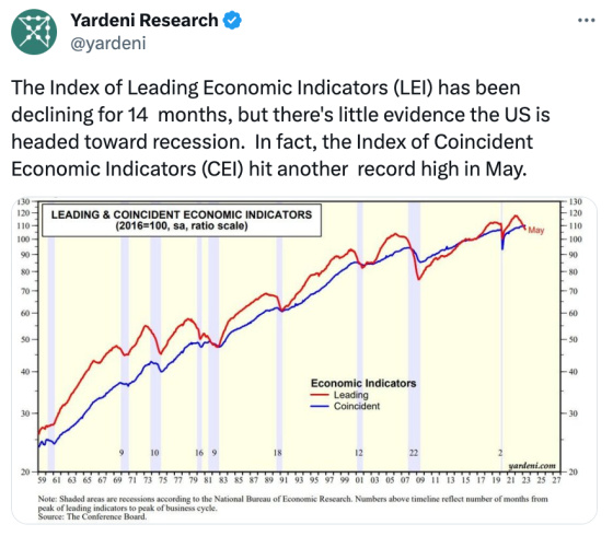
And while it seems like we’re going to have to see something out of the blue that will trigger material cuts by the Fed, economist Ed Yardeni thinks we have been going through a rolling recession in which segments of the economy have been contracting while others have been growing without triggering an overall recession. This tends to explain the stock market holding up well, particularly large-cap tech companies and homebuilders having made a terrific recovery with so few existing homes for sale due to locked-in homeowners with mortgage rates far below market rates such that new homes are the only game in town in terms of supply.
This chart shows the relative performance of a homebuilders index compared to the S&P 500 over the last 12 months.
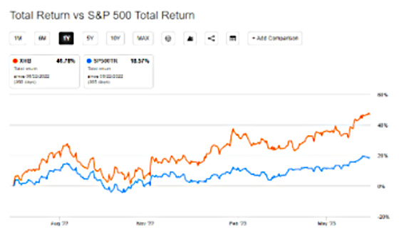
Since late 2022 home builders have been on a tear as demand has been strong in spite of higher mortgage rates. Builders can buy down rates for purchasers, and they are able to move more products and start more homes because there is far less competition from existing homes due to the lack of supply.
I think this sums up how perplexing the economic situation is. The inverted yield curve and Leading Economic Indicators are clearly signaling trouble ahead, and yet, current conditions are pretty good, all things considered.
Last week I also talked about how Fed Chairman Powell is a Grateful Dead fan and ended the post citing the lyrics from Fire on the Mountain, suggesting that his policies might be stoking some fires in the distance that may come closer over time, threatening to cause far more damage than initially expected. Perhaps the better lyrics to cite would have been from the Jerry Garcia/Robert Hunter song Deal.
Since it costs a lot to win, and even more to lose,
You and me bound to spend some time wond’rin’ what to choose.; Goes to show, you don’t ever know,
Watch each card you play and play it slow,
Wait until that deal come round,
Don’t you let that deal go down, no, no.
Jay Powell and the Fed have been aggressively fighting inflation by raising short-term rates at a very rapid rate to levels not seen for many years and curtailing the balance sheet. There are already costs to winning the war, and there presumably will be a lot more. At the same time, he and many others believe that the costs of losing and not stamping inflation out are too high and far exceed the cost of fighting the battle. As a result, failure is not an option.
Powell is now at the point where short rates are now higher than inflation, and inflation is falling. He now has to play each card and hand thoughtfully, methodically, and slowly in order to avoid causing more harm than he needs to if the labor market and stock market are any indication, then he has been playing his hands skillfully.
Leave a Reply