
The future is clearly unknowable other than the certainty of our demise. All we can do is to utilize our knowledge and experience to assess when we think the odds are in our favor or against us and take action accordingly. Everything comes down to risk and reward, frequency and severity.
For many people this means putting money in well-diversified, low-cost index funds and banking on the U.S. economy continues to grow over the long run, companies innovating and growing their earnings, and having a long enough horizon to correct for overvalued entry points.
For me, I like to see if I can find predictable patterns in numbers to see where advantages or disadvantages may lie. This is particularly important now as my bias towards variable rate loans is being put to the test as our cost of funds is now coming close to break even in our portfolio in terms of current rate approaching the 10-year fixed rates available at the time they were originated. The following table shows our current situation.
| Current Cost | Fixed Rate @ Origination | 10-Year Fixed Rate Currently | |
| Weighted Spread | 1.84% | N/A | N/A |
| Libor | 1.91% | N/A | N/A |
| Interest Rate | 3.75% | 3.80% | 4.35% |
Fortunately, from 2012 through May 2018 we have saved a cumulative $75 million in interest and this does not include the onerous yield maintenance pre-payment penalties not paid or value diminution from having to require buyers to purchase our properties by assuming our loans. I estimate this to be another $100 million. Since 2012 we have repaid approximately $926 million of floating rate debt via 12 sales and 26 refinances. In some of these cases, our 1% pre-payment penalties were waived since we refinanced the loans with the same lender. This would never have been the case had our loans been fixed rate and subject to yield maintenance.
So up until this point having bet on floating rate has been a winning bet. The question now is whether it will be going forward. Before answering that, let me first look at why there has been such attention drawn to the 10-year Treasury yield breaching 3% for the first time since late 2013.
Why is this so significant? I think this table puts it into some perspective.
| Trough Date | Trough Yield | Peak Date | Peak Yield | Trading Days |
| 10/15/93 | 5.19% | 11/7/94 | 8.05% | 266 |
| 10/5/98 | 4.16% | 1/21/2000 | 6.79% | 325 |
| 6/13/03 | 3.13% | 6/28/06 | 5.25% | 283 |
| 12/18/08 | 2.08% | 4/5/10 | 4.01% | 323 |
| 7/25/12 | 1.43% | 12/31/2013 | 3.04% | 358 |
| 7/8/16 | 1.37% | 4/25/18??? | 3.03%??? | 450??? |
One can see that over the last 25 years we have had lower lows and lower highs in 10-year Treasury yields within each cycle. We have been knocking on the door of 3.04% and this is the closest we have been to reaching a prior peak by far. The question is will we breach it? Of course, no one really knows. There are a lot of good reasons as to why the old high may be taken out. We have a huge issuance of Treasury securities to fund the much bigger deficits resulting from greater spending and the tax cuts, less foreign buying of Treasuries, a more hawkish Fed, inflation finally hitting the Fed’s target and a decent labor market with some improving wages. And yet, with all that, so far the old high has held. Can we turn to history and numerical patterns for any guidance?
Let’s first look at the yield curve. The yield curve is quite flat right now as the following chart shows the difference between 10-year Treasury yields being quite close to 2-year Treasury yields.
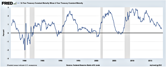
Since yield curve inversions are almost always precursors to recessions and flattening yield curves tend to end up inverted, I wanted to analyze if the current difference between 10s and 2s of less than 50 basis points leads to a higher probability of short-term interest rates being lower one and two years later. I use the three-month T-Bill as the proxy for short-term rates.
I went back to June 1, 1976, and tracked the spread between 10s and 2s every day and then looked at the three-month T-Bills one and two years out and calculated whether it was higher or lower. I also looked at the data from 1984 forward and 2000 forward as I think we are in a very different economic, demographic, technological, and inflationary environment than we were in the 1970s and early 1980s. I was also curious to see if there was some trend differential in the more modern era of the 2000s.
This first table shows what happens to short-term interest rates one year later when the 10s minus 2s is less than 50 basis points. As a point of reference, it’s approximately 45 basis points as of this writing.
| Time Frame | % Lower | % Higher | % Lower when 10-2
Less than 50 |
Median Increase When Rates Rose |
| Since 6/1/76 | 53.7% | 46.3% | 64.6% | 1.41% |
| Since 1/1/84 | 58.4% | 41.6% | 72.4% | 1.05% |
| Since 1/1/2000 | 57.2% | 42.8% | 70.8% | 1.04% |
One can see that the odds are pretty favorable, particularly from 1984 forward, that short-term rates will be lower in a year. The probabilities are meaningfully higher than the overall averages when yield curve dynamics are not considered. This tells me that the yield curve does have some predictability regarding the direction of future rates. And what if one is banking on lower rates but it turns out to be one of those 30% to 35% scenarios that go against you? The downside seems pretty manageable if one uses the median increase as their measurement. The table above shows that rates have gone up by approximately 1% one year later.
What happens two years out? Let’s turn to the next table to see.
| Time
Frame |
% Lower | % Higher | % Lower when 10-2
Less than 50 |
Median Increase When Rates Rose |
| Since 6/1/76 | 56.1% | 43.9% | 71.4% | 1.73% |
| Since 1/1/84 | 56.6% | 43.4% | 80.8% | 0.75% |
| Since 1/1/2000 | 59.5% | 40.5% | 87.2% | 1.31% |
Here we can see that the probabilities increase pretty meaningfully that rates will be lower and they are quite a bit higher than the averages that don’t take the yield curve into account. This is particularly true since 2000. And, like the one-year results, if they do end up higher the median has been in the 1.00% range as well.
Besides historical probabilities being on the side of lower rates so is the positioning of hedgers and speculators in the futures market in terms of longer-term rates. The following chart shows how hedgers (“smart money”) have a record long position (betting on 10-year Treasury yields dropping) while the next chart is reflective of speculators (“dumb money”) being exceedingly optimistic that rates will continue to rise.


With sentiment extremely negative towards bonds and if history is any guide in terms of what a flat yield curve means for future short-term interest rates, it would appear to me that long-term Treasuries are positioned to rally and the Fed has no more than 100 basis points of increases left in them before they have to start cutting again. While this will cause some more pain for us over the next year or two as variable rate borrowers, I still believe we should end up with a lower cost of funds having been variable given the savings we have already banked and being able to benefit when the Fed does start cutting again. All the while we will have preserved great optionality in terms of exiting our loans when we deem it optimal, versus when they mature and the pre-payment penalties have burned off.
While I’m putting a lot of weight in the omniscience of the yield curve and I may be wrong, I am adhering to the wisdom of Erasmus who stated:
“In the kingdom of the blind, the one-eyed man is king.”
“In the kingdom of the blind, the one-eyed man is king.”Click To Tweet
Gary,
Looks to me like you have the bases covered!
Sorry to miss your meeting tomorrow. Hopefully see you soon.
Don