
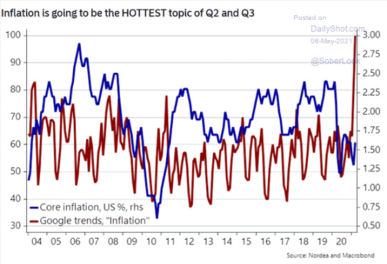
Inflation is clearly one of the hottest topics for investors in particular and society more generally as the following chart shows. Core inflation has not moved commensurately with the exploding interest in the topic.
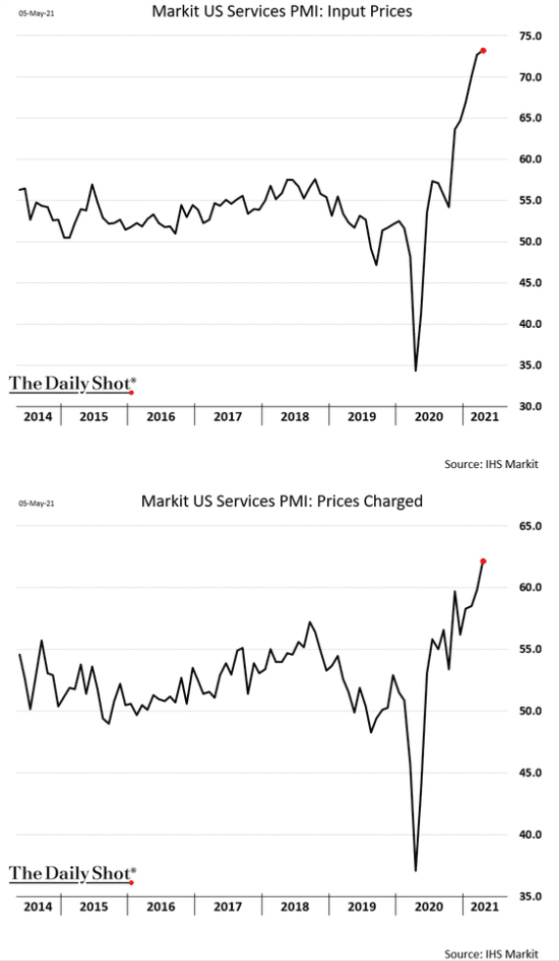
The following charts show why inflation is such a hot topic. The first three are based on surveys carried out every month to come up with the indices in the charts. One can see that service sector prices and input costs have increased quite a bit relative to previous surveys.

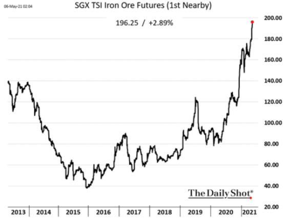
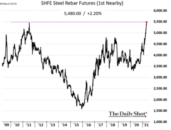
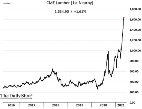
Industrial commodities have exploded higher along with lumber.

This has led to investors seeking out ways to prosper from inflation. This chart shows how assets have increased significantly in just a couple of months for a newly created ETF focused on inflation beneficiaries.

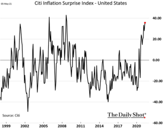
Now, let’s look at some charts for the contrarian readers who might think that we are closer to a top in inflation concerns versus a bottom. The first one is the Citi Inflation Surprise Index which collaborates how inflation data comes in relative to expectations. It has definitely been coming in hot. This tends to result in economists adjusting their forecasts higher such that they ultimately become too bullish on inflation and then the cycle reverses. From the chart, it looks like we might be approaching a change in the cycle.
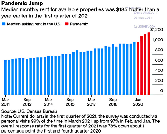
Rent inflation would need to rise substantially to keep inflation above 2% like the following chart shows.
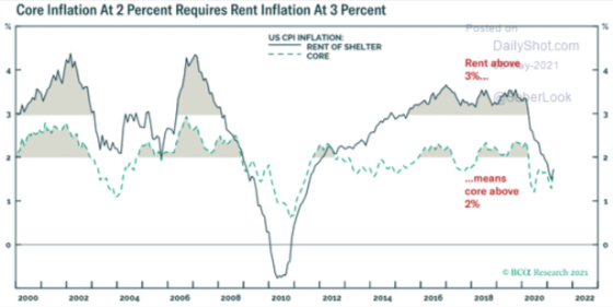
Rents are starting to increase so maybe this component is gaining momentum which could move overall core inflation higher.
Future five-year inflation expectations five years out has made a sharp recovery from their bottom but time will tell if it will get back to its more normal 2.50% level.

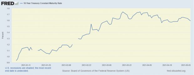
Treasury investors don’t seem to be as worried about inflation as the 10-year yield has started to come down to less than 1.60%.
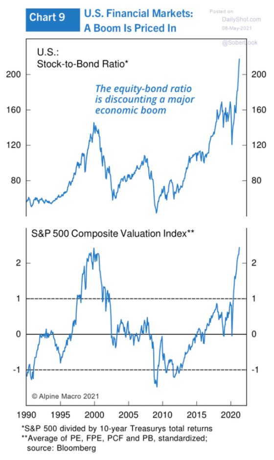
Stock market investors are much more optimistic about future economic growth relative to bond market investors as the following charts show.
The yield curve doesn’t seem to suggest the same boom times ahead as the stock market is pricing in. The following chart shows the spread between the yield on the 10-year Treasury note versus the 2-year note. When the spread is high, Treasury investors are factoring in faster economic growth in the years ahead and when it’s narrow or negative it is betting on the opposite. And while we are clearly off of the bottom, we are not near the 2.50%+ spread that tends to signal strong growth in the future. In fact, it looks like the spread is starting to compress again which could signal that economic growth will be more tepid going forward.

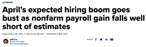
And then there was the very surprising jobs report that resulted in far few jobs created in April and downward revisions to previous months.
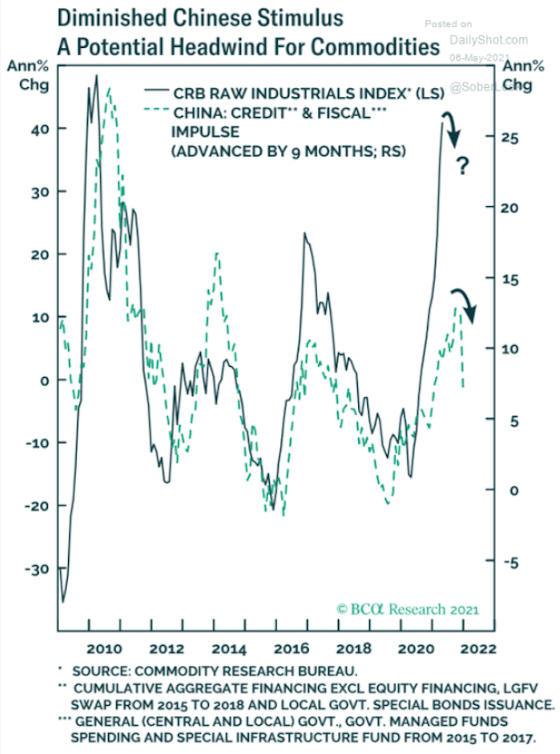
Finally, China has been a huge driver of economic growth and demand for commodities. This chart shows that as credit growth contracts in China it has a negative impact on commodity prices in the months ahead.
It will be interesting to see what happens with commodity prices and overall costs in the economy. Right now there are clearly cost pressures due to supply chain issues, millions of people out of the labor force while the demand for labor has been increasing, enhanced buying power from stimulus checks and unemployment benefits, and a frenzy to purchase homes, just to name some of the major factors. The Treasury market isn’t buying that inflation is a long-term problem right now and Chairman Powell is prepared to let it run hot in order to keep the recovery on track and get millions of people re-employed. And if the latest jobs report is an indication of an economy that might be cooling just a bit, then perhaps Powell is right to remain patient.
Leave a Reply