
Jamie Dimon and Ray Dalio have both come out and said that despite America being such a strong country and performing well economically, not all is right when looking under the hood. While the election of Donald Trump caught many by surprise there is no denying that he tapped into the underlying disconnect that was brewing, particularly among white males who have been left out of the economic gains enjoyed by the well educated, urban, knowledge-based workers. I decided to put together some charts to help explain many of the reasons for this great divide.
Do Things Have to Get Better?
Let’s first look at where we stand today. This chart from Gallup was really quite shocking to me, especially how uniform the trends are for the three income classifications.
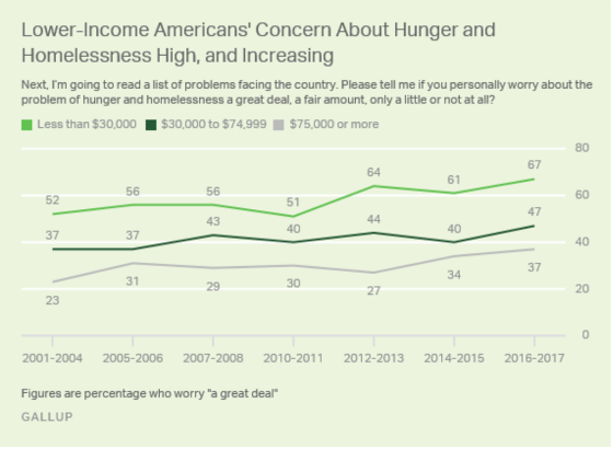
It’s possible that as other issues become less of a concern that homelessness and hunger can become more prominent. Regardless, the trend is not our friend here. It is clear that more and more people are living closer to the edge.
The Fed seems to think that it has achieved much of what it set out to do to heal the economy in the wake of the Great Recession and the following chart would suggest they are right.
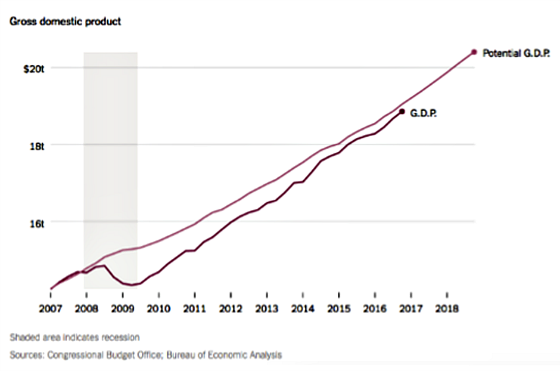
The gap between actual GDP and potential GDP has narrowed quite significantly pointing to very little slack in the economy, especially with the unemployment rate at 4.50% and inflation approaching 2%. Ahh but looks can be deceiving. Potential GDP is an estimate and subject to revisions so let’s see how it has been revised over the years.
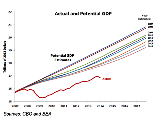
This chart puts the Fed’s self-congratulation in the same light as President Bush’s carrier landing in 2003 declaring mission accomplished in Iraq which turned out to be premature. Potential GDP has been ratcheted down dramatically and we have a nearly $3 trillion gap between actual GDP and the 2007 estimate. This is the heart of so much angst in the country.
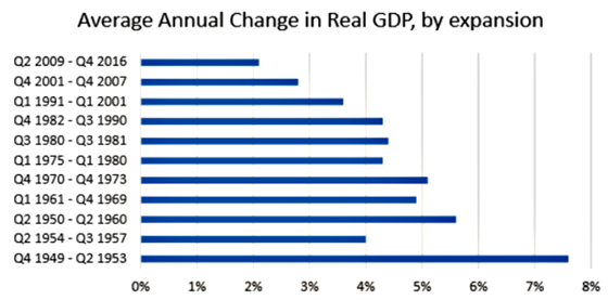
This chart shows how slow this recovery has been to all of the other expansions since the end of World War II.
A meaningful portion of the declining growth rate of the economy has to do with the reduction in labor force participation which requires a much greater level of productivity to replace the lost labor hours.

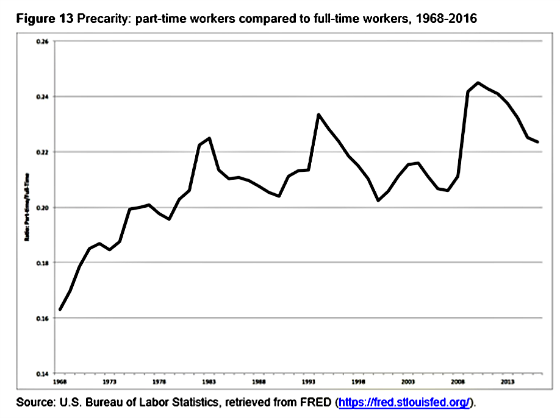
The situation is compounded by more people working part-time which clearly has an impact on wages.
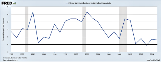
And the productivity that is occurring is at far lower levels than in previous years as the following chart shows.
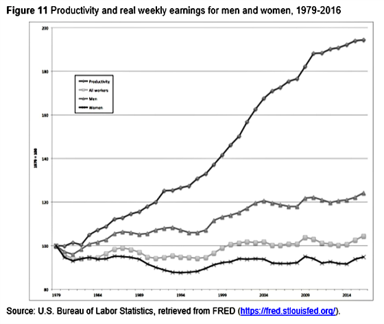
And the productivity gains we have been generating have not translated to meaningfully higher wages.
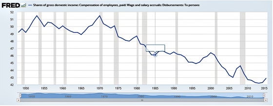
The share of gross domestic income paid out in wages and salaries has been dropping quite significantly since 1970.
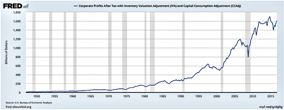
Corporate profits have grown quite significantly as the wage share of gross domestic income has dropped.
As our economy has become more financialized, financially-oriented firms have seen their profits grow quite significantly.

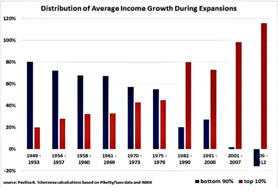
This has led to quite significant income inequality as the financial class, including corporate executives, have prospered, while much of the rest of the country has stagnated. Although the trend of the 10% capturing a greater share of national income has been in place since 1949, it really began accelerating after Ronald Reagan took office and has continued in force since.
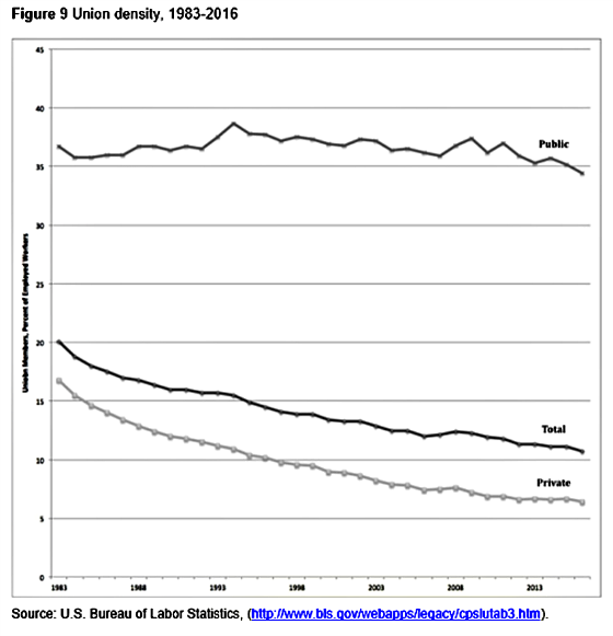
Perhaps one of the reasons for the increasing inequality is the reduction in the bargaining power of labor due to less union membership that has been taking place over time as the following chart shows.
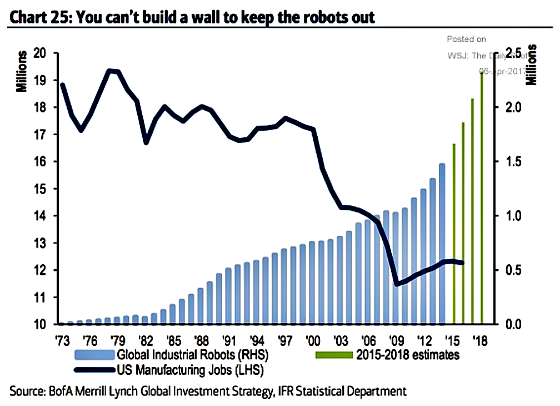
Manufacturing jobs have often been well-paid and unionized but it’s clear that the trend is for less manufacturing employment and more automation globally in the manufacturing space.
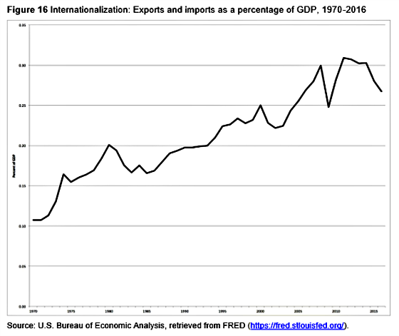
The share of world economic output has been more tied to global trade over the years which allows more firms to have access to labor pools from around the world which presumably serves to make it harder for labor to bargain for higher wage gains.
I’m not quite sure of why I’m reminded of Eric Clapton’s powerful song he wrote for Derek and the Dominoes called Got to Get Better in a Little While but I am after reading about Dimon’s and Dalio’s concerns. The song is very dark and yet has an underlying optimistic tone to it in that things have to get better since they really can’t get much worse. I think it will be very difficult to reverse these trends but it never hurts to hold out hope that they might.
Don’t you know what’s wrong with me?
I’m seeing things I don’t want to see.
Sniffing things that ain’t no good for me.
I’m going down fast, won’t you say a prayer for me?
[Chorus:]
It’s got to get better in a little while.
It’s got to get better in a little while.
It’s got to get better in a little while.
It’s got to get better in a little while.
The sun’s got to shine on my guitar someday.
Revolution all across the land.
Just like Sly, you got to take a stand.
Please don’t hurt nobody, don’t knock them down;
Give them a helping hand to get off the ground.
[Chorus]
[Bridge]
Still one thing that you can do;
Fall down on your knees and pray.
I know the Lord’s gonna answer you.
Don’t do it tomorrow, do it today.
Over to You:
My question for you is, does it have to get better? Are Dimon and Dalio right?
Leave a Reply