
I am a huge fan of the Daily Shot. It is a daily composition of charts and interesting news clips that allow subscribers to get a very good feel for what is going on around the world in stock and bond markets, commodities, and real estate. It was deemed so valuable that the Wall Street Journal has entered into an agreement with the Daily Shot to only make it available for subscribers beginning November 1st. Fortunately, I’m a subscriber so I will continue to receive the daily updates. I thought I would highlight some of the most important charts that caught my attention. As it’s been said, a picture is worth a thousand words so rather than writing my usual 1,000+ words, I thought I would let the charts do most of the talking.
Charts – What Does the Data Show?
The first two charts show how sentiment can change rapidly, especially when it comes to leveraged financial firms. Deutsche Bank has become center stage as investor confidence in Germany’s largest bank is rapidly declining as the following chart shows.

And then news came out that Deutsche Bank’s settlement with the Department of Justice for its role in the subprime debacle would be $5.4 billion versus the originally reported $14 billion being sought by the DOJ. Shares moved quite a bit higher after this announcement.

Crude oil took a big leap as OPEC said they would cut production in November. While I’m skeptical that OPEC will truly follow through without cheating, the market is currently taking OPEC at its word.

The Saudis were clearly targeting high-cost shale producers when they said they would defend its market share regardless of price. The following chart shows that U.S. shale producers were not going to go down without a fight as they have ruthlessly focused on becoming more efficient.

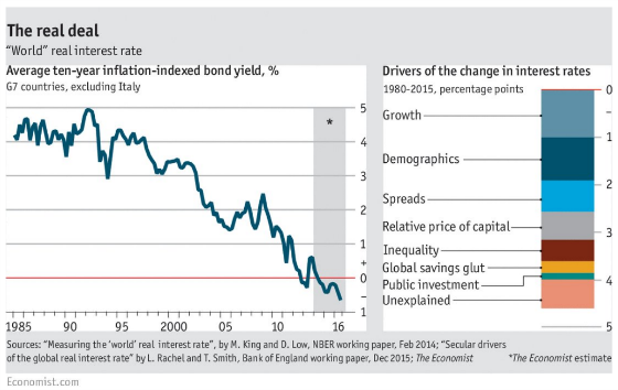
Turning to my favorite subject of interest rates, the following chart shows how inflation-adjusted interest rates around the world have dropped dramatically over the last 20 years and the drivers of that change.
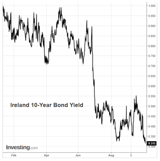
Ireland, which was one of the hardest hit economies during the Great Recession due to its huge real estate bubble and bad lending practices, has seen its long-term interest rates drop dramatically in the last few months. It is hard to believe that Ireland’s 10-year yields are approximately 1.25% less than U.S. 10-year Treasuries.
Germany’s two-year yields are deep into negative territory.

Tensions are heating up yet again between India and Pakistan. After India’s surgical strike into Pakistan, the Indian currency dropped sharply.
 Despite some negative headlines regarding pending home sales dropping in the U.S., on a non-seasonally adjusted basis, pending home sales are holding up well.

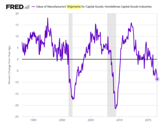
While housing has been holding steady and should be additive to growth, manufacturing remains mired in a slump as the durable goods chart shows.
To confound things further in terms of assessing the economy, the following chart shows how M2 money growth is expanding rather nicely which suggests capital is circulating in the economy via higher loan growth.

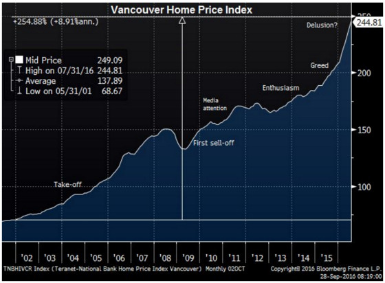
Besides interest rates I am very interested in studying bubbles, especially in real estate markets. Vancouver looks like a poster child for its residential market being in a huge bubble. The following chart shows how home prices have gone through the roof in Vancouver.
The following chart is one of my favorite indicators to assess whether a metropolitan area is at risk for real estate values going down (or up). We have used this extensively at CWS over the years to help us assess entry and exit points for various markets. This chart is a big red flag for Vancouver. On the other hand, this should not be surprising given how rapidly housing prices have gone up. This chart also shows that a market can remain elevated for much longer than most rational investors would ever believe possible. Construction employment has been highly elevated since 2011 and if one had sold then, this would have resulted in having left a lot of money on the table.

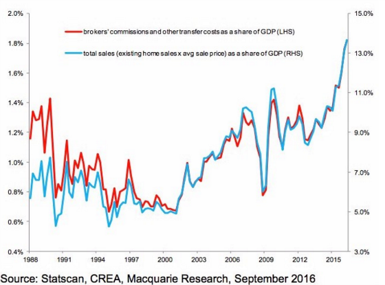
Not surprisingly, with much higher property values and greater transaction volume, the commissions paid to brokers has skyrocketed as well. Now that the local government has enacted a very expensive transaction tax for foreign buyers I would expect the Vancouver market to begin cooling off considerably.
To end on a positive note, there has been a dramatic downtrend in teen births over the last 35 years.

Over to You:
Are you a fan of data and charts?
Leave a Reply