
I remember reading about how Peter Drucker knew to leave Germany after Hitler came to power. He said it was simple. He read Mein Kampf and took Hitler at his word. Since he was Jewish he had to assume he was a target and he determined that the risk of emigrating was far less than the risk of staying. I don’t mean to equate Hitler’s words and actions with chairman Jay Powell‘s of the Federal Reserve, but I must admit that I found it a bit perplexing that so many investors and Wall Street economists were banking on the Fed moving its target in terms of when it would start raising interest rates because of higher inflation and bond market concerns. It would have been such a credibility-destroying move for the Fed and Powell to articulate a different course.

Powell has been adamant in saying that he’s willing to let the economy run hot in terms of inflation because he is looking at it over a long-term perspective so that the average inflation rate should be around 2%. This means that it’s ok for inflation to exceed 2% for a period of time because it has been under this threshold for so long. More importantly, he is much more focused on the labor market getting back to where it was pre-Covid and he is not going to do anything to impede that, even if it means inflation running hot for a period of time.
The following chart has shown how investors have aggressively priced in the Fed moving short-term interest rates ahead of the Federal Reserve’s public statements and projections.

The next chart is a longer-term view of how investors have priced in Fed moves relative to what the Fed actually did. One can see that investors have consistently over-estimated Fed tightening, although not 100% of the time. The blue circles show where the market was behind the curve. I’m not sure why 2016-18 was omitted but even including this the market is typically more hawkish than how the Fed actually adjusts rates. One can see that the market is starting to price in a Fed liftoff before the Fed’s own projections.

As I wrote about recently, I believe that the uptick in inflation is more of a short to a medium-term phenomenon, particularly as the base effects of comparing to prices a year ago will show that inflation has heated up. As time goes by, however, and the denominator gets replaced by higher prices, calculated inflation will presumably become tamer. In addition, we are also dealing with the effects of much higher energy prices compared to a year ago which is impacting reported inflation. If energy prices stay flat or drop then this will lower CPI as well. With that being said, the Fed tends to focus on inflation gauges that exclude food and energy because of their volatility so this may not be very impactful in the Fed’s inflation assessment.
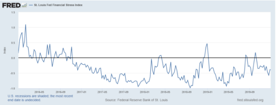
I remain in the camp of taking Jay Powell at his word that short-term rates will not move before 2023. With that being said, he has had to course correct in the past. For example, he was on a clear tightening path in 2018 much to the consternation of President Trump who kept saying how incompetent he was and that he had no feel for the markets. Trump turned out to be right as the financial markets cracked as financial conditions tightened in 2018 and he had to turn on a dime and start loosening monetary policy and cutting rates. This chart shows how financial market stress increased significantly towards the end of 2018 as investors were screaming for a more accommodating Federal Reserve. Once the Fed changed directions, then financial stress dissipated greatly.
I don’t see Powell reversing course this time because both he and Janet Yellen are clearly taking on a more populist point of view and really looking at the bruised labor market. They want to see a meaningful improvement not only in the overall unemployment rate and participation rate, but they want particular groups of people to recover more rapidly. They have noted black unemployment levels as well as the participation rate of women as two groups to which they are paying very close attention.
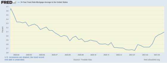
Last week I mentioned that I was going to pay close attention to consumer spending via high-frequency indicators to get a feel for whether people were going to continue to save a meaningful percentage of their stimulus checks (or put them into crypto investments) or spend them. With mortgage rates up nearly 0.50% from their lows, I’m now going to pay close attention to housing market indicators to see if that starts to crack.
The following charts show how red hot housing has been in the wake of Covid and how homeowners are clearly prospering from an environment in which demand has greatly increased while supply is quite constrained.
The purchase mortgage index is off to a strong start in 2021.

Borrowers are taking out much bigger loans for purchases than refinances which reflects the run-up in home prices.

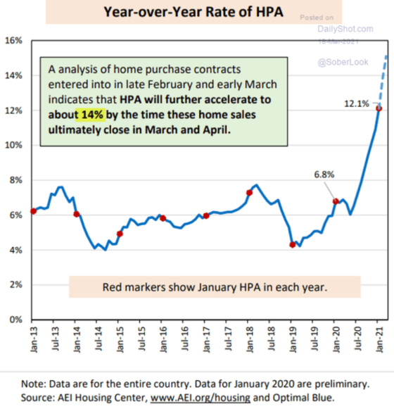
This chart is one that definitely has me take a pause. We are now above trend in home prices which is what happened when housing peaked in 2005-7.

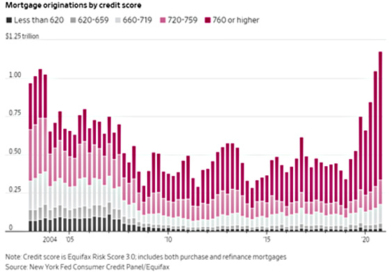
What is different this time, however, is that lending standards are much stronger so that homes are in much stronger hands. There are far fewer speculators financed with high leverage loans with very little margin of safety. The average FICO score for conventional loans for purchases in February was 758, which is quite high. This chart shows how FICO scores have increased quite significantly over the last few years.
Another factor impacting home prices is that there is very little inventory available to buy as these charts show.

With more demand and less supply, the natural response is for prices to increase as the following shows have been the case and on an accelerating basis.
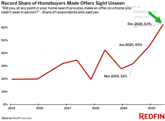
Finally, as a testament to the difficulty in buying a home, this chart shows that a shockingly high percentage of recent home purchases have been sight unseen. This might need to be taken with a grain of salt, however, as one can do a tremendous amount of research on the internet to give one confidence about how much to pay for a home and even purchasing one without even having gone inside. I even did this myself in 1994 (before the internet) when I was out of town for work and Roneet said she saw a home that intrigued her. Since I knew the values in the area and had a good feel for the location, I told her to make an offer immediately. We ended up getting the house and we made a very good buy.
Leave a Reply