
Milton Friedman famously said that “Persistent inflation is always and everywhere a monetary phenomenon.” I have never been much of a monetarist because I thought there were many other factors influencing inflation, particularly demand factors, technological innovation, demographics, and the presence or absence of animal spirits among investors and capital providers. With that being said, however, the incredible growth in the M2 money supply during the Covid emergency and the resulting explosion in inflation clearly shows how powerful it can be in raising or lowering inflation when enough monetary firepower is unleashed or withdrawn.
Milton Friedman famously said that “Persistent inflation is always and everywhere a monetary phenomenon.”Click To TweetMilton Friedman had a long and distinguished career and was an intellectual giant. He passed away in 2006 at 94.
Now let me turn to a much younger (and still living) person that I have followed and who has influenced my thinking about the economy, monetary system, and interest rates: Cullen Roche. He possesses a great combination of intelligence, a deep understanding of how the monetary system works, intuition, and common sense. I have really admired his thought process and his deep dive into the plumbing of our monetary system, and I have found him to have a good feel for where the economy and markets are headed. I think this tweet gets to the heart of what has happened on the inflation front over the last couple of years, and Milton Friedman should be smiling down from wherever he is.
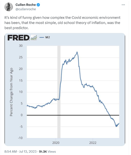
Keep this chart in mind when looking at the ones related to CPI that will follow shortly. Notice how the trajectory is very similar to that of M2.
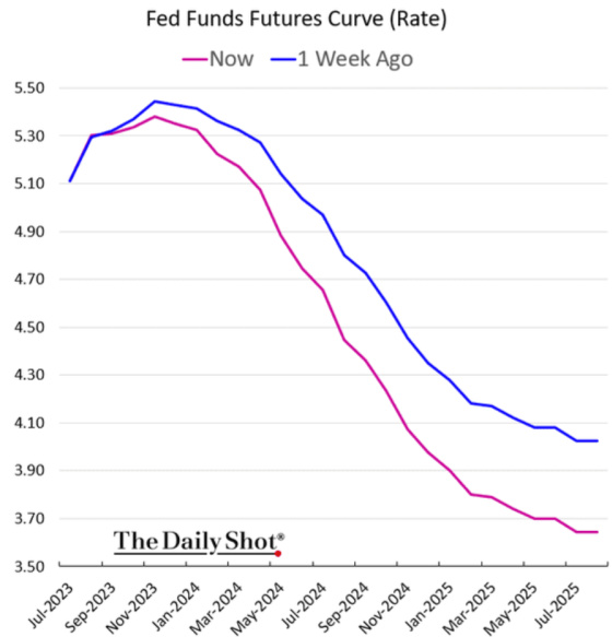
Last week was pretty important in terms of investors thinking that the Fed has succeeded in breaking the back of inflation.

This is what happened to interest rates after the very favorable inflation reports.
The 10-year Treasury is down approximately 0.28% from its recent peak on July 7th.

Although the 2-year Treasury backed up on Friday, it is still lower by approximately 0.30% from its recent peak of 5.01%.

The market is now pricing in a steeper drop in short-term rates over the next two years.
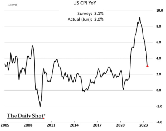
Here are some of the key inflation charts, and once again, keep the trajectory of the earlier M2 chart in mind when viewing these.

Overall, CPI is following a very similar path as M2 but with a lag. Inflation, as measured by the Consumer Price Index, has clearly peaked and is now decelerating rapidly, just as is happening with the M2 money supply.
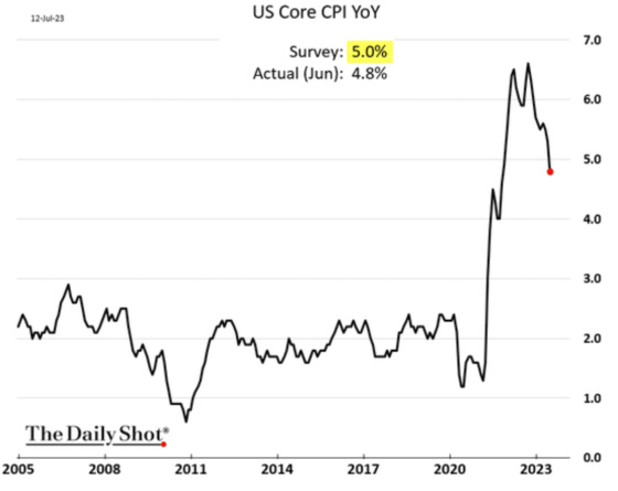
When stripping out food and energy, however, the downtrend is not as dramatic as Core CPI is still running hot but lower than where it peaked.
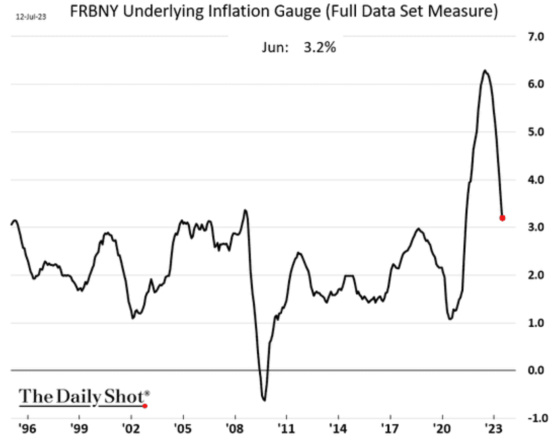
The Federal Reserve Bank of New York has its own inflation gauge, which attempts to capture “sustained movements in inflation from information contained in a broad set of price, real activity, and financial data.” According to its latest release, the “prices only” measurement of inflation fell to 2.5%, while the overall index was 3.2% based on economic activity and financial data. It looks like we’re well on our way to being in the pre-Covid range of 1% to 3%.
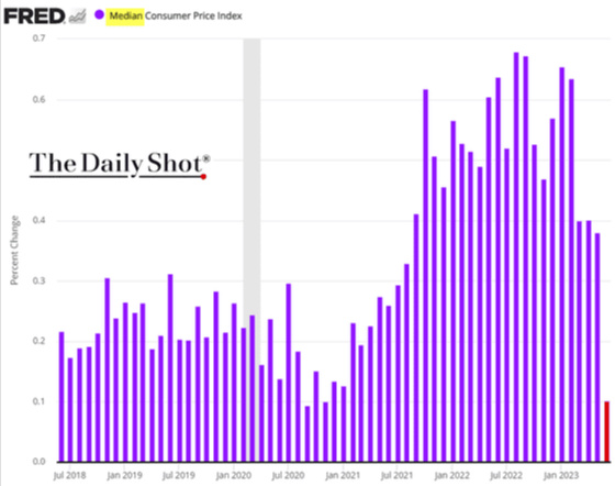
When looking at some other alternative measures of inflation, these, too, are showing rapid drops. This is the Cleveland Fed’s Median Consumer Price Index which tracks the median change of all of the CPI components. Just like the M2 chart, this one has now dropped precipitously and is back at pre-Covid levels, and even less.
The same is true for its 16% Trimmed-Mean Consumer Price Index, which strips out the highest and lowest 16% changes among the CPI components to come up with a less volatile average. This, too, has dropped quite a bit and is now at pre-Covid levels as well.

I will end this post by returning to a pattern I have been really focused on, which is the yield curve, recessions, and employment trends. In previous posts, I have shown how economic slowdowns and contractions don’t occur until the yield curve has become positive again. Thus, the relatively good economic news we’re seeing and a labor market that seems to be holding up is consistent with past cycles, given how inverted the yield curve is.
I created this chart through 2019 to avoid the Covid employment distortions to compare the differential between the 10-year Treasury note yield and 3-month T-Bill yield versus annual nonfarm employment growth.

One can see that when the yield curve is most inverted, employment growth is near its peak, and when the yield curve is most positive, employment growth is typically at its most negative. Thus, it’s not very surprising that we’re seeing employment growth hold up well, given how inverted the yield curve is (short rates higher than long rates).
I created a similar chart, but this time using the unemployment rate and having it go through the most recent data, despite the Covid distortion. One can also see that this too follows the same pattern (not surprisingly). During yield curve inversions, the unemployment rate is at its lowest, and when the yield curve is most positive, the unemployment rate is typically at its cyclical peak.

Given all of this, it is not surprising to see Lael Brainard, the President’s Director of the National Economic Council (NEC), taking a victory lap for the administration’s ability, as well as the Federal Reserve, particularly since prior to being appointed to her role at the NEC she was Vice Chair of the Federal Reserve, for being able to bring down inflation dramatically without hurting the job market.

It will be interesting to see one year from now if her speech was a top in the employment market. I’ll have to put a tickler in my calendar to revisit this subject next July.


Great write up Gary as usual. I also listen to Cullen Roche, agree with about 70% of his comments/assertions and think Lyn Alden is among the best thinkers if one listens to her analysis. Luke Gromen is another good one. The money supply impacts everything; I think it blows a hole in the MMT phenomenon. The Bitcoiners with associations similar to Austrian Economics theories seem much more in tune and what is happening now and historically. Cap rates also move with the supply of money available. Direct correlation. Further research I find interesting is credit creation adjusted for inflation and the net spread between them being 2% greater or we experience trouble.
I think that the manner in which we attempt to deal with inflation has to reflect what led to the inflation. Most prior inflation episodes during the past fifty years have been driven by excessive demand. The standard approach was then to raise interest rates to lower the demand side.
However, the COVID pandemic led to a vastly diminished supply as workers were forced to remain away from producing goods and services. Thus, the emphasis of a responsible response should have focused directly on aiding the recovery of production.
I have a hard time understanding why raising interest rates is a sound approach to aid the increase of production.
At the same time the FED was raising interest rates, the administration passed legislation for an increased level of spending for infrastructure as well as inducements for investments. The implementation of these new projects required an addition to a workforce that was diminished during COVID.
Thus, the FED, supported by Treasury officials, was engaged in trying to reduce employment while the White House-driven legislation was aimed at increasing the need for employees. As Lincoln once said, “a house divided against itself cannot stand”!
I suspect that the best overall approach by the FED and Treasury officials would have been to raise interest rates only slightly and then let the economy drift back slowly to a more acceptable long-term situation.