
Investors are always asking the question what inning are we in when it comes to where we are in a particular cycle. It’s a pertinent question related to housing as it has had a tremendous run in terms of home price appreciation, equity build-up among homeowners, and tremendous profits for builders and investors. Now that interest rates have risen fairly sharply (prior to a pullback late last week) which has led to mortgage rates shooting up, it’s understandable to ask if this is the beginning of the end or just the end of the beginning? Or somewhere in between?

The stock price of U.S. homebuilders has been negatively impacted by the run-up in mortgage rates as the following chart shows.

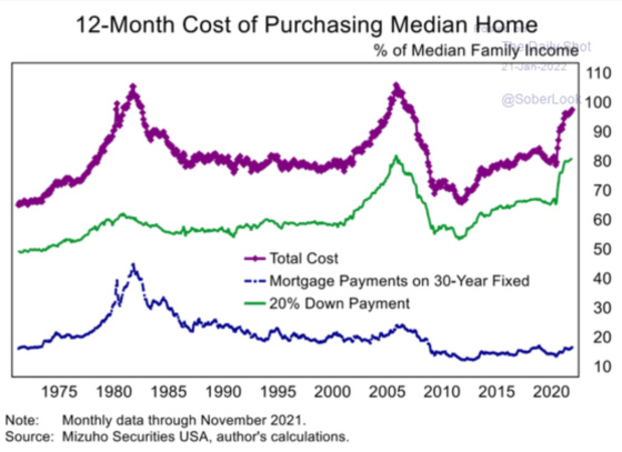
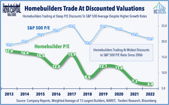
Part of the concern among investors is that homes, which have already appreciated tremendously, will become even less affordable in the wake of higher interest rates as this chart is already starting to show.
D.R. Horton is the largest U.S. homebuilder. It has had a remarkable run since bottoming during the Covid carnage in March 2020 when it hit approximately $32 per share. It recovered very impressively and hit a peak of nearly $110 in December 2021. It has since corrected by approximately 20% in the wake of higher mortgage rates. Clearly not a stock for the faint of heart.

The following table shows the incredible growth of the company as reflected by the company’s balance sheet. Pay particular attention to its inventory (homes and lots) line item. It has quadrupled since 2012, going from approximately $4.2 billion to approximately $16.5 billion.

Source: Seeking Alpha
One can see from the following chart that D.R. Horton is a behemoth and that its scale gives it a big advantage in terms of efficiencies and operating margin, although not as efficient as Lennar.

Source: Seeking Alpha article
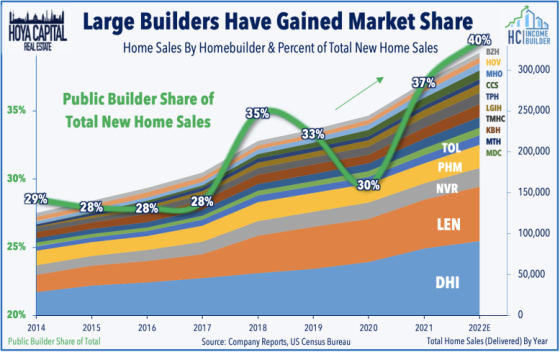
Large builders have gained more market share during the pandemic which has made it a much more concentrated industry.
Source: Seeking Alpha article
Here is a longer-term chart for D.R. Horton. One can see that during the housing bubble in the early to mid-2000s, the share price peaked in July 2005 and it took approximately 12 years to get back to that level. This is why investors always want to know what inning of the game they’re in because if you invest at peak bubble valuations then it can take a very long time to fully recover one’s investment (not taking into consideration lost purchasing power from inflation). From looking at this chart, the tremendous move upwards should give investors pause as it does look like it’s been primed for a significant correction.

The following charts show current housing activity, which continues to depict a housing market that has higher demand than supply. Existing home sales were quite robust in 2021.

While having recovered tremendously and showing strong growth in 2021, we are still at levels less than in the mid-2000s.

There’s an argument, however, that home sales would be materially higher if there were more homes available for sale. These charts show how tight inventory levels are.

Builders like D.R. Horton are understandably trying to supply the strong demand by constructing more homes. We now have more homes under construction than we did during the previous peak in 2005.

Unfortunately with labor challenges and supply chain issues, the completion of new homes is far less than the number under construction. This is the first time it’s been in deficit and since the bubble years we have downshifted quite materially to a situation where completions are not much more than the number of homes under construction.
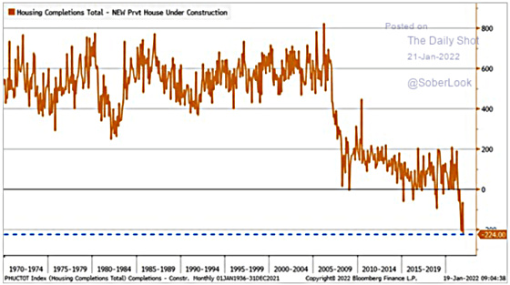
Back to the question in terms of what inning we’re in. All of the remaining charts come from this fantastic analysis of the U.S. housing market. To me, this is the money chart. Quite simply, we are not producing enough housing. This alone gives me some comfort that there’s a margin of safety for being invested in the U.S. housing market in growing areas.

Let’s not rely on one chart, however, and look under the hood to analyze other important components to determine if there is a compelling risk-reward relationship for investors.
One important variable to analyze is the strength of homebuyers and homeowners. In the last cycle, they were quite weak due to low down payments, poor borrower quality, and interest rate exposure to adjustable-rate loans that had big payment change risk. There were also far more speculators in the market. Today we have less speculation and more well-capitalized buyers along with deep-pocketed funds and institutions looking to acquire homes to rent out, which takes supply off of the market for prospective home purchasers.
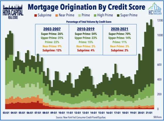
And from a mortgage origination perspective, the quality of new loans being originated is much better than during the bubble days and this is another indication that we are more in the earlier innings than the later ones.
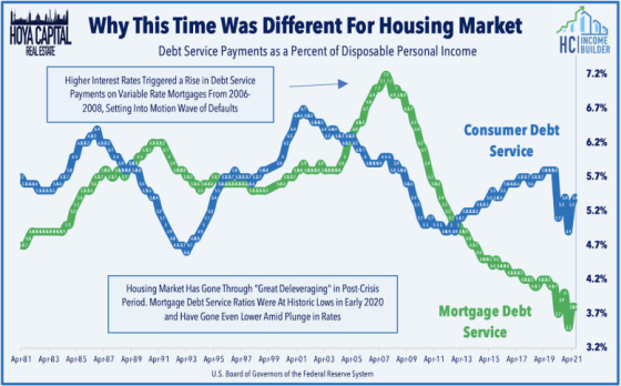
With interest rates having dropped, mortgage payments are quite manageable.
And while home prices have appreciated quite impressively, they are still in line with incomes, unlike in the early to mid-2000s.

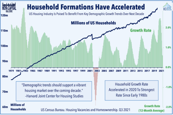
Demographics are also very supportive of housing as millennials come into peak home-buying ages and household formations are quite strong.
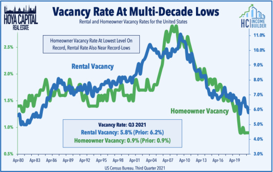
Vacancy rates are also extremely low which should be supportive for housing demand as there are not a lot of vacant alternatives available.
And then there is Covid which has led to more people wanting to purchase homes to have more space and to be in less crowded areas and to get away from crime and homelessness in urban areas and to have more space to work remotely.
Finally, all of these positive factors can be neutered if one is paying too much for homes or for companies producing them. According to this chart, investors seem to be pricing in a future that is not nearly as rosy as the above indicators would suggest.
This would seem to provide investors with a decent margin of safety in the event that housing holds up better than the market is pricing in.
Thanks for this very insightful analysis.